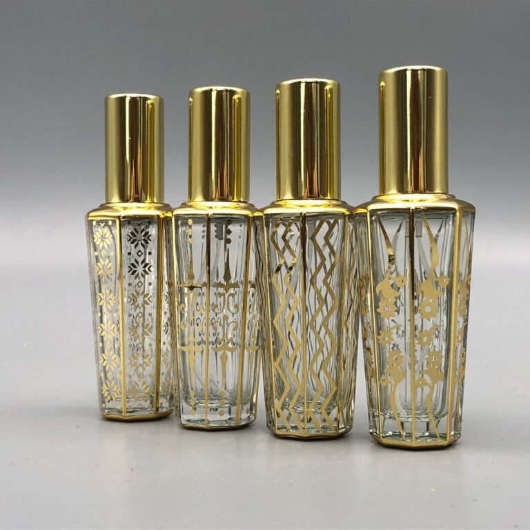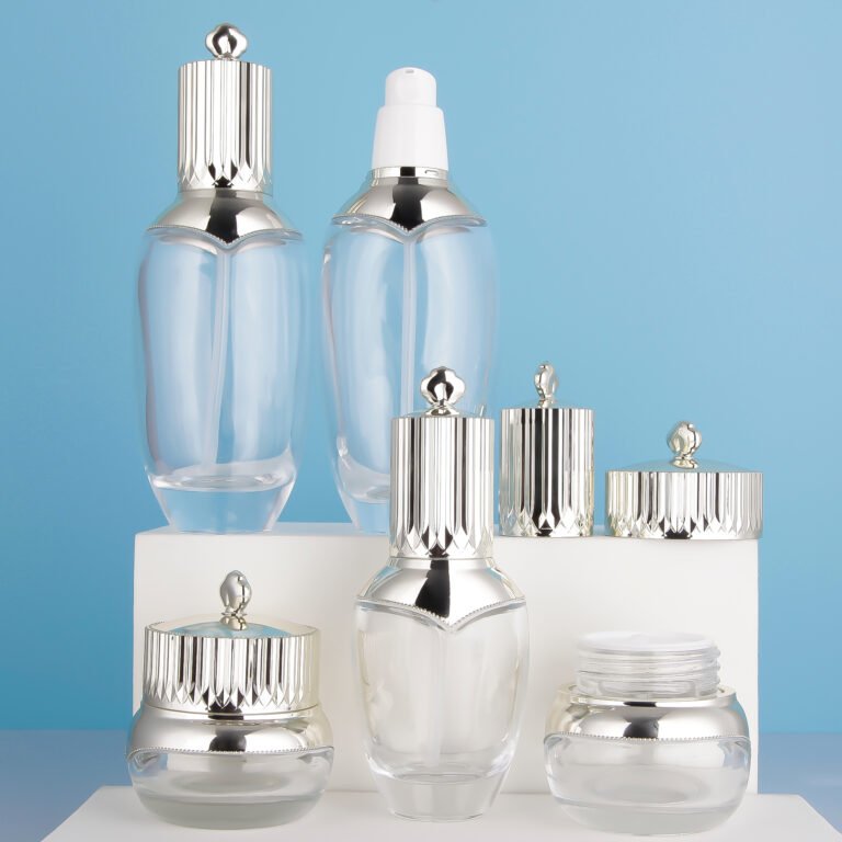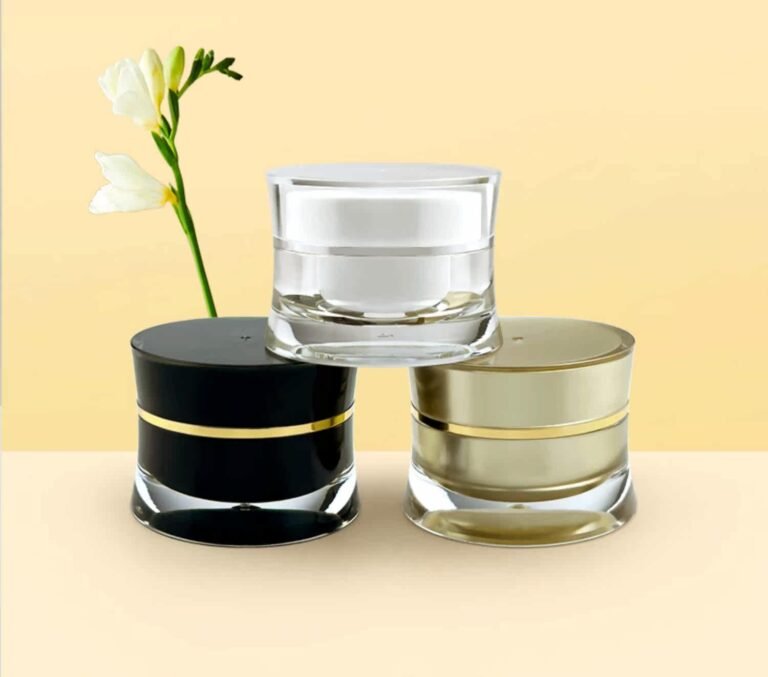
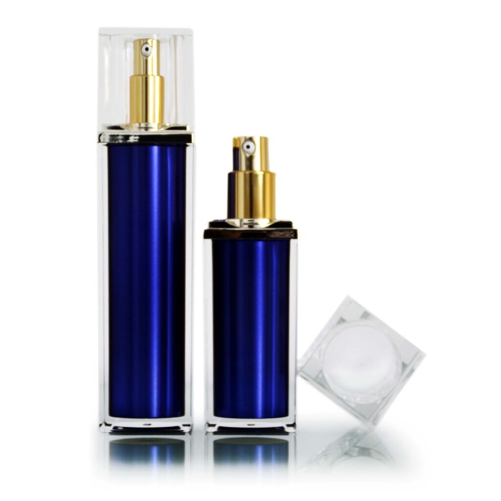
A small bottle gives every line of label copy a job. The challenge is to make the product recognizable, keep essential information legible and preserve a calm visual hierarchy on a curved surface.
Measure the real panel
Ask for the usable label or print area, not just overall bottle dimensions. Shoulders, bases and seams can interrupt artwork. Wrap a printed paper proof around an actual sample to see where text distorts or disappears from the front view.
Build a clear hierarchy
Product name and variant should be identifiable at a glance. Supporting information can use a second level, while required text needs reliable contrast and adequate size. Avoid shrinking everything equally when space is tight. Consider a carton or insert for information that does not belong on the primary display panel.
Test color and finish
Transparent labels reveal the product color and any bubbles beneath them. Metallic or glossy surfaces can reduce readability in bright light. Review the filled package under several lighting conditions, and check adhesion after routine handling.
Prepare for production
Confirm bleed, safe areas, barcodes and registration tolerances with the printer. Market-specific cosmetic labeling rules should be checked before artwork approval.
One more check
Print the artwork at actual size and check it from a normal reading distance. Then review the bottle in a product photograph. Both views matter: one serves the customer holding the product, and the other serves the customer browsing online.
The best small-bottle label looks simple because the information has been prioritized carefully. Physical proofs are far more reliable than screen mockups alone.