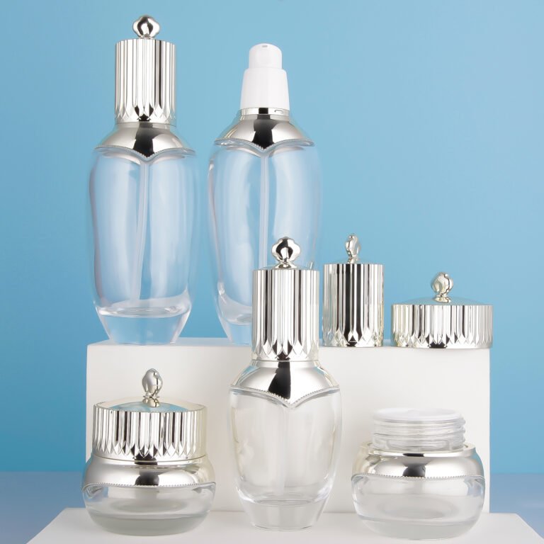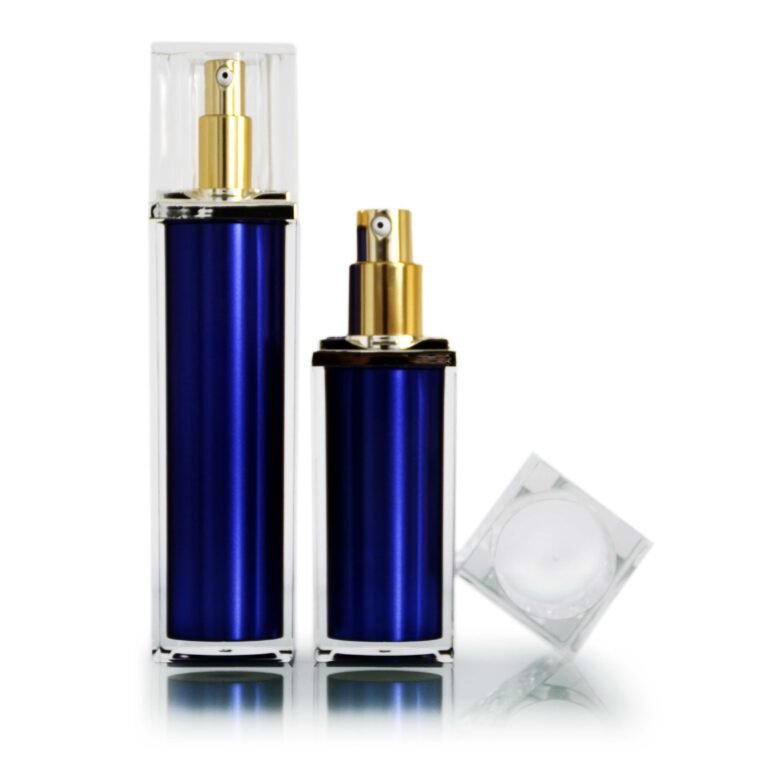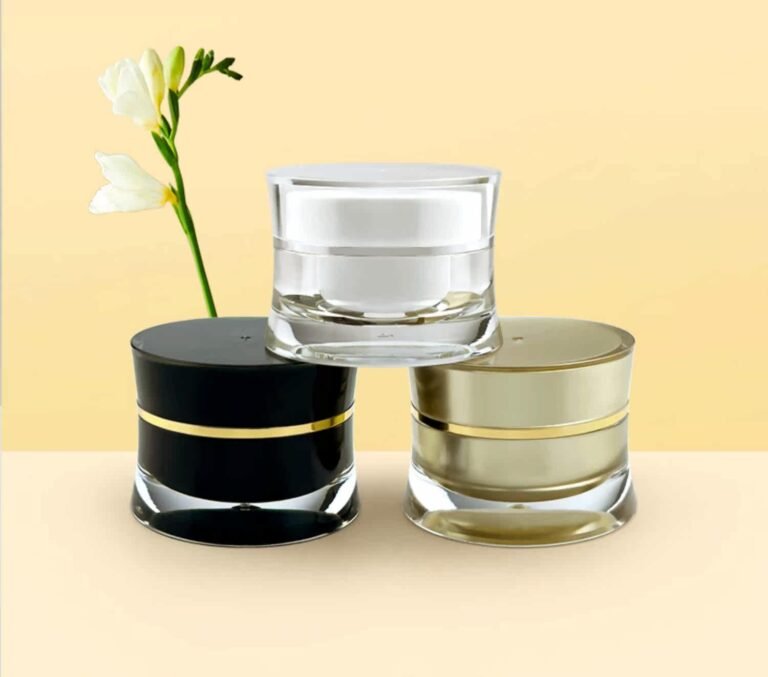
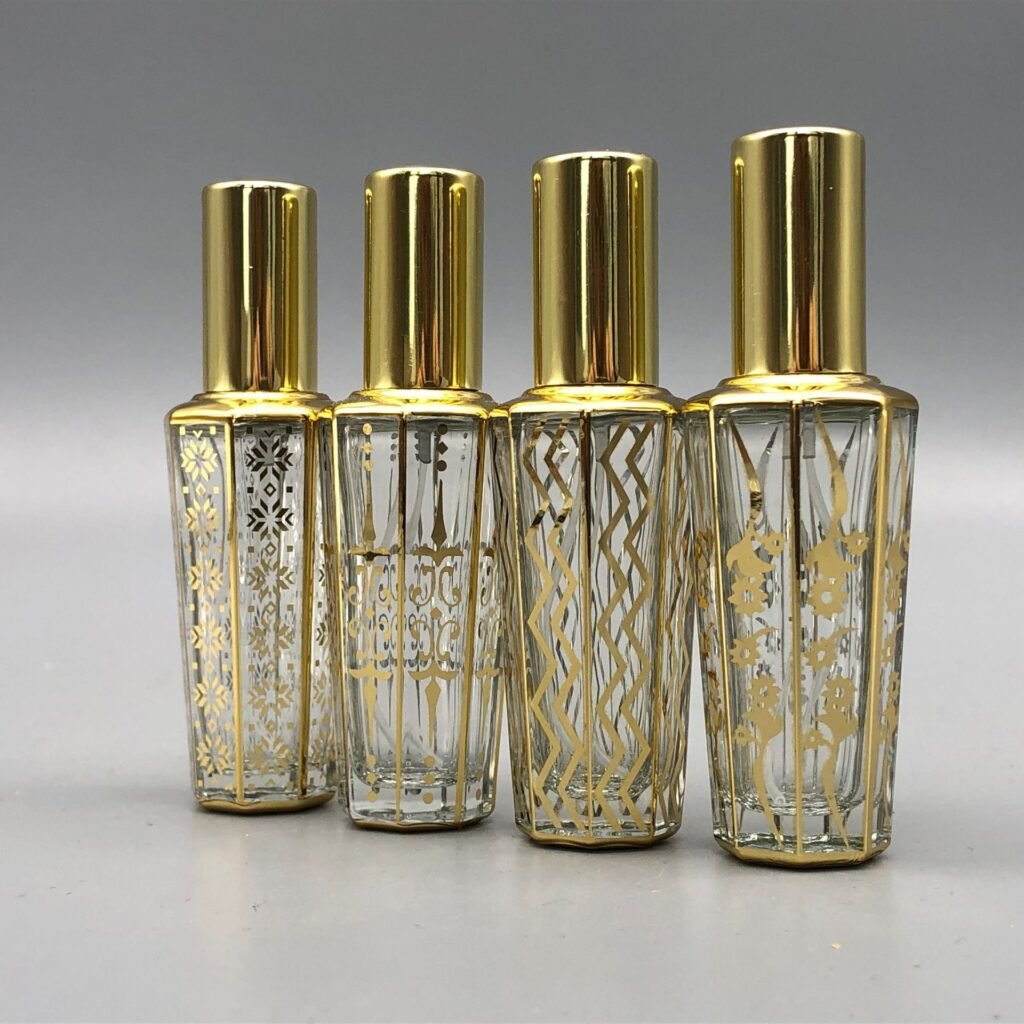
Decoration makes a standard bottle feel specific to a brand. Color, coating and print can also change how the package ages, how labels adhere and how details appear under different lighting. The safest design process uses physical samples before production approval.
Begin with the base material
A translucent bottle, opaque coating and metallic sleeve produce different visual effects even with the same artwork. Inspect the undecorated bottle first. Its wall thickness, seams and curves influence how color and graphics will appear on a finished pack.
Choose the right surface treatment
Common options include printing, hot stamping, coating and labels. Each has different limits for fine type, registration and coverage around curves. Ask the supplier for a decoration area and proof method. Small text that looks crisp on screen may be difficult to read on a reflective surface.
Test handling and durability
The pack may be touched with damp or oily hands, placed in a bag and rubbed against secondary packaging. Evaluate scuffing, adhesion and color consistency using samples that reflect the intended process. Check the result in daylight, warm retail lighting and the light used for product photography.
Keep compliance text legible
Leave enough room for required information and avoid relying on a decorative finish for essential text. Regulatory requirements vary by market, so the final artwork should be reviewed for each destination.
One more check
Request a production-method sample, not only a digital render. A real printed or coated component reveals registration, texture and edge quality. Sign off on the exact reference used for later production checks.
Approve decoration against a physical reference with documented color and placement tolerances. That reference helps keep later production runs consistent.