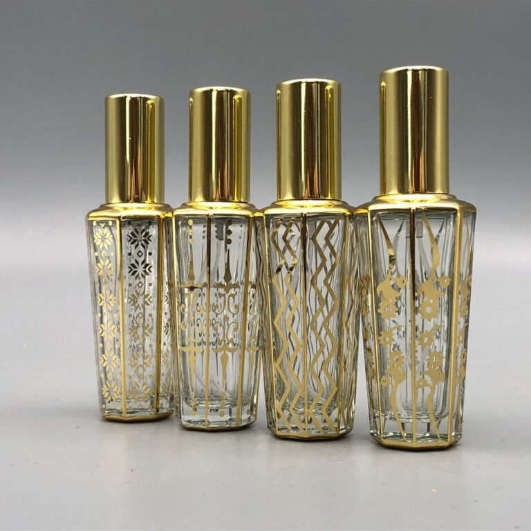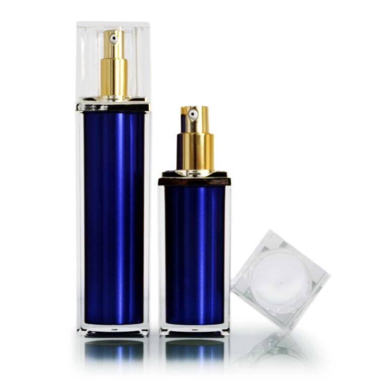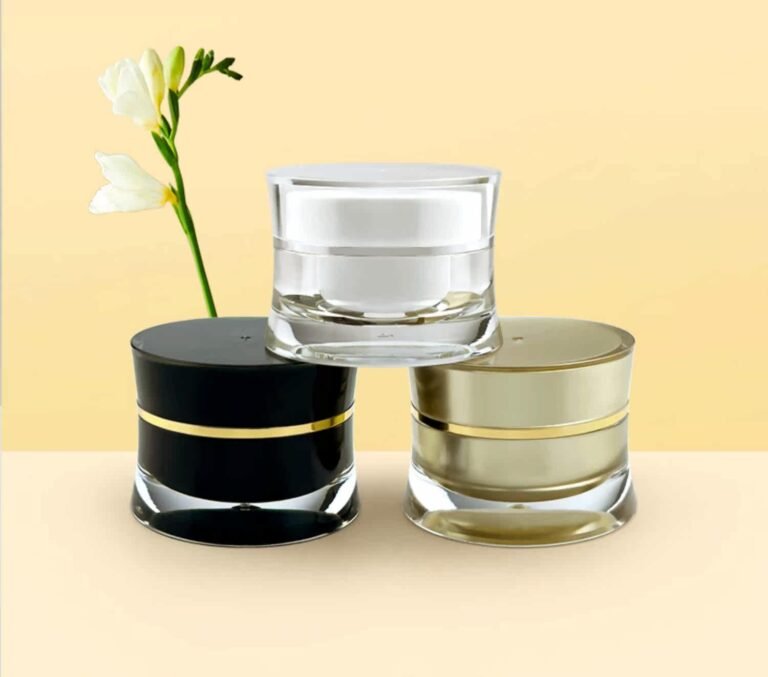
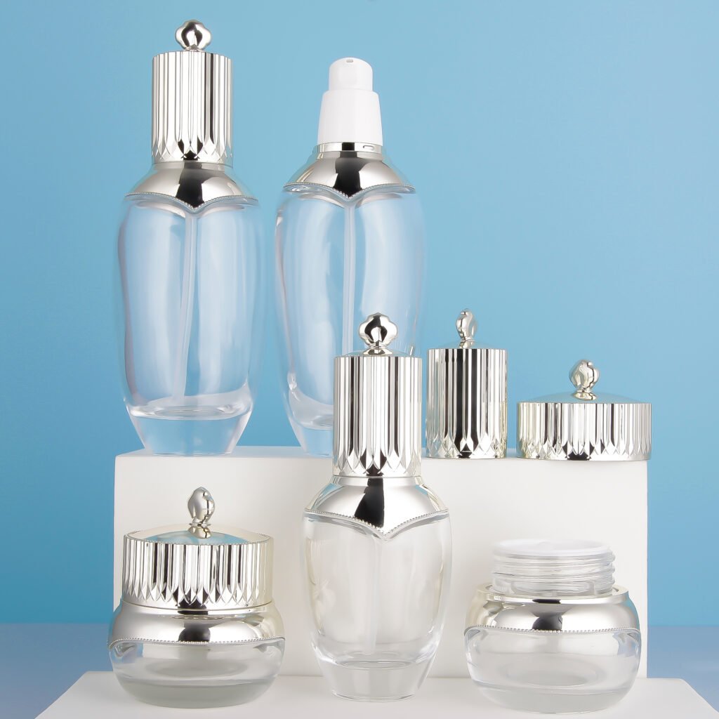
Premium packaging is often associated with shine or weight, but the experience is broader. Consistent proportions, a closure that fits cleanly and a dispenser that works every time can matter more than an expensive-looking finish.
Start with coherence
The bottle, cap, decoration and outer carton should share a clear visual language. A narrow bottle with an oversized cap can work if the balance is intentional. Compare the entire range together, including different capacities, to catch inconsistent heights, tones or label positions.
Notice the small interactions
How much force does the cap require? Does the pump prime quickly? Does the bottle stand firmly when nearly empty? These details influence quality perception during every use. Ask several people to handle filled prototypes without instructions and note where they hesitate.
Use finishes carefully
Metallized surfaces, clear walls and decorative details can add impact, but they also reveal fingerprints, scuffs or color differences. Test the finish under retail light and in product photographs. Keep essential text readable and avoid decorative treatments that interfere with the grip or closure.
Protect the first impression
A well-designed bottle should arrive clean and intact. Review transit packaging, component separation and abrasion points before production. Premium presentation includes the unboxing condition, not only the studio image.
One more check
Invite both design and operations teams to review the final sample. The designer sees visual balance; the filling team sees application and handling constraints. A shared sign-off reduces last-minute compromises.
A premium result usually comes from disciplined fit, finish and usability. Use physical comparison samples to decide which details genuinely improve the experience.