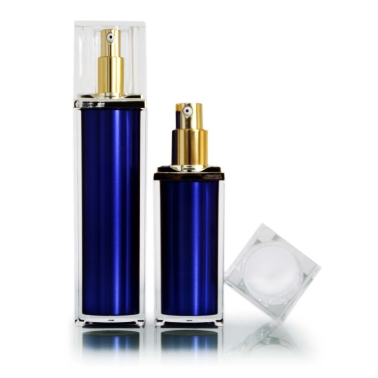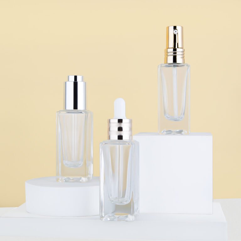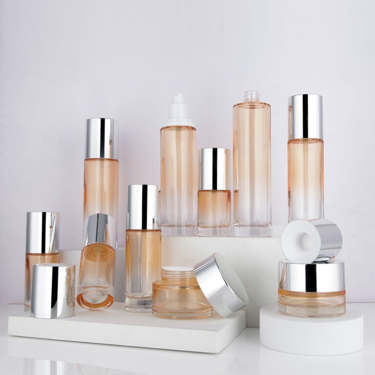
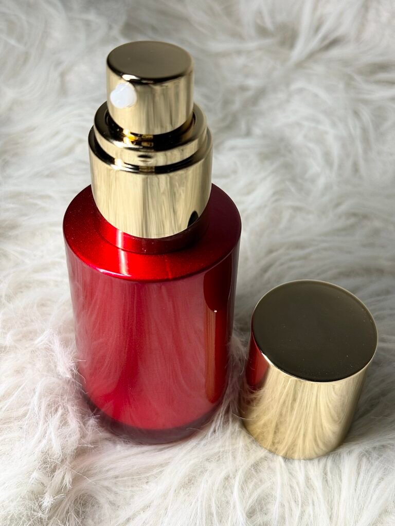
Amber bottles bring warmth and a familiar apothecary look to skincare packaging. Their visual appeal is clear, but color alone should not be treated as proof that a formula is protected. Material, wall design, closure and storage conditions all matter.
Use color as a design tool
Amber can create contrast with white, black or metallic closures. It can make a small bottle feel distinctive while allowing a coordinated family of jars, pumps and sprays. Check color consistency across different component types, because glass and plastic may render the same target shade differently.
Separate appearance from protection
A darker container can change the amount and type of light reaching a formula, but the level of protection depends on the complete package. If light sensitivity is a concern, run appropriate stability studies with the final filled pack. Do not infer a shelf-life benefit from the bottle photograph.
Check dispensing details
Amber glass and amber plastic formats may have different neck finishes, weights and decoration options. Assess the bottle with its chosen pump, dropper or cap. Look for leaks, residue around the neck and the customer's ability to judge the remaining fill.
Plan artwork on the real surface
Dark or translucent surfaces affect label contrast. Print tests should include the filled color of the formula and the lighting in which the product will be sold.
One more check
Review the same filled sample at the start and end of a suitable stability program. Color shifts in the formula, label changes or closure residue may alter the final appearance, even if the empty bottle looked ideal.
Amber is a strong visual direction when it supports the product story. Validate any functional claim separately with the actual formulation and packaging system.